Pages

Sabtu, 13 Februari 2016

WHAT MARK ENGLISH IS DOING NOW


I've never met an illustrator who didn't fantasize about being a fine artist.  (I have my own thoughts about whether this is a worthy ambition, but that's not today's topic.)

Very few illustrators go on to have careers as gallery painters. By the time they're finally able to pull it off, they're either too exhausted or too broke or too accustomed to accepting instructions from paying clients.  Perhaps they never had the backbone.  Perhaps they tried it and didn't like it.  (The illustrator Robert Fawcett was a successful gallery painter in NY who turned to commercial illustration because he found it less dishonest and vulgar than the Manhattan fine art scene.)

Mark English was one of the premier illustrators in America, beginning in the late 1960s.  He won numerous awards from his peers and had a huge influence on the field of illustration, working for all of the major publications such as McCallsTimeSports IllustratedRedbook, and Atlantic Monthly.

But in the 1990s, he made a change and began working as a fine artist.  Today his paintings are sold in a number of galleries internationally and his fine art has been compiled in books dedicated to his work.

It is interesting to note how his work changed when he was no longer answerable to a client or art director and was able to paint whatever he wanted, to his own personal standards.

For example, compare these two portraits, the first painted as an illustrator and the second painted as a fine artist: 


Clearly, English spent a great deal of time and effort developing the technical skill to paint realistically, but after hundreds of pictures, he no longer felt that such a skill was important for his work.  Instead, he chose to distill and simplify, to change his color palette and put a stronger emphasis on design.

Or compare these two paintings of partially dressed women:


One difference is that a commercial client would never tolerate a frontal view with an open kimono.  But more important, English now takes a far less literal view; he clearly puts priority on the abstract design with a more stark, high contrast composition, flattening out the shapes and making the image less accessible.

English grew up around horses in Texas and probably has more first hand experience with them than any other major illustrator of his era.  His illustration of a horse below is very tight, but once English jumped the fence and escaped from the corral, his treatment of horses became very loose and free.  For me, this later picture is reminiscent of the simplified cut out designs that Matisse made in his later years.


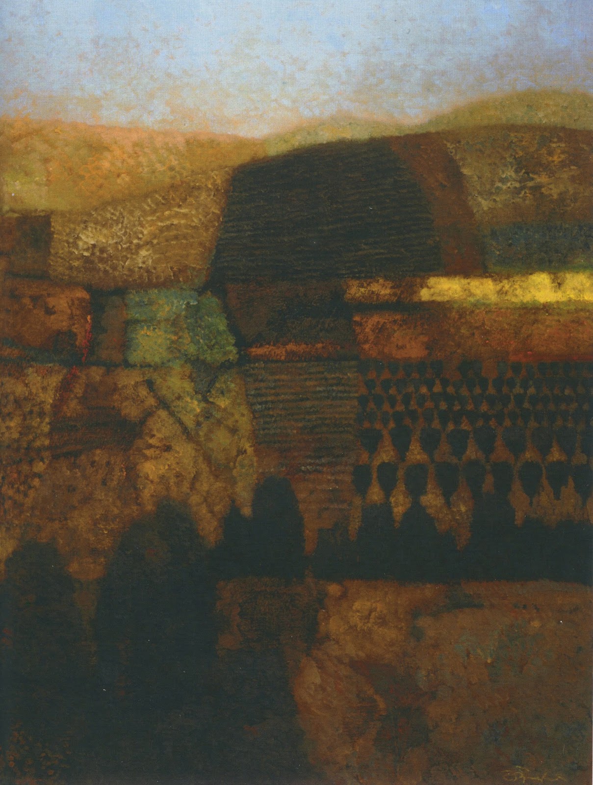
Here are a few of my favorites from among his more recent "fine art" paintings.  You will see that, especially in his landscapes, he looks for the abstraction in nature and brings it forward, almost (but not quite) to the point of obliterating his subject matter:


Were these paintings in English all the time?  Would he have preferred to work this way from the start?  Or were they only decocted from a long career in commercial illustration?

It's difficult to say.  But it's clear that English is making artistic choices now from a position of strength-- he has the technical skill to make any kind of picture he wants, and he is no longer the starving young artist that had to find ways to satisfy the client's taste.  English says he no longer has to make concessions to the taste of employers: "I think all artists are limited by fear of failure, even more so as an illustrator than as a painter. Today, I don't much worry about it."

Under these conditions, it's interesting to witness a strong artist's new priorities.

Senin, 25 Januari 2016

AUSTIN BRIGGS' OPINIONS


We're always hearing that artists require freedom to express their opinions. 

Artists need freedom to express political opinions, or to show explicit content.  Artistic opinions might offer a social conscience, or point out ironies in our culture.   The outrageous perspectives of underground cartoonists unsettle the status quo.

This focus on the artist's opinions is why advertising art is held in such low regard: the corporate advertiser, not the artist, controls the content.

But making art involves all kinds of opinions, not just opinions about content.  It involves opinions about  how to describe form, opinions about abstraction,  opinions about design.  Visual opinions such as these are equally present in advertising art and museum art.

Here is an advertisement drawing by Austin Briggs with a real point of view:


It has no political or social content but man, what an opinion!   To me, it makes much of today's "social commentary" art look spineless.

 Here is a series of drawings by Briggs for newspaper ads in the 1950s. The social commentary is nonexistent but look at his powerful choices and robust lines describing form:


Briggs had opinions about where to apply emphasis.  He had opinions on how to convey vitality.  He had opinions on how to depict folds in heavy cloth:


I like Briggs' opinion on how to abstract a little girl's dress:


Here is a sample of one of Briggs' original sketches for this series of ads so you can see how he worked:


We've come to believe, for reasons that escape me, that an artist's political and social opinions are more significant than their visual opinions.  Starting at least as early as the pop artists,  unremarkable ads, labels or comic books were transformed by artists such as Warhol and Lichtenstein into fine art.  The physical image might be almost identical, but what mattered was the artist's commentary on mass media, commercial printing and the ironies of modern culture.

I agree that in some cases, this type of commentary can be a higher form of art than the visual choices in a good drawing.  But I've also listened patiently to lectures by artists such as Jeff Koons, Damien Hirst and Tracey Emin in which they discuss the opinions underlying their art.  They may be eloquent,  but I often find their social commentary simple minded and their politics juvenile.

When I decide where to spend my time,  I weigh those social opinions against the opinions about form manifest in really good drawing.  Often, I find that plain good drawing--  even with no ironic content-- is more enriching.  Of course, that's just an opinion. 


Selasa, 19 Januari 2016

WORTH A SECOND LOOK: HANK VIRGONA


Hundreds of talented illustrators are never mentioned in the history books on illustration.  For example,  Life Magazine employed an average of 25 different illustrators every week.  In Life's first 50 years, they produced over 60,000 illustrations. Yet who can remember more than a handful of their names?

Many of these "forgotten" illustrators were terrible and are better forgotten, but some did excellent work.  They've been forgotten for reasons unrelated to quality; perhaps they only worked as an illustrator for a short time before moving into fine art.  Perhaps they were ahead of their time, or behind it.   They weren't influential as illustrators; they didn't start a whole new branch on the tree of illustration, or even a new twig, but their work at least qualifies as a blossom.   And as Thomas Gray reminded us,  "Many a flower is born to blush unseen, and waste its sweetness on the desert air."

For the most part, the only way to find the work of these illustrators today is by sifting through the original publications where their work appeared   Many of those publications are now crumbling with age.

I've been fortunate recently because older artists who clipped tearsheets from magazines have generously handed their collections down to me in the apparent belief that I'll help keep the torch burning.  (Thanks, Nick Meglin!)  I don't know a better way to honor this work than to show the pictures I like on this blog, in the hope that people will give them a second look.  


Hank Vigona was born in 1929.  In his twenties and thirties, he illustrated for  Fortune, Harpers, Argosy, Seventeen and The New York Times.  He worked in a loose style that I enjoy very much.


His heroes weren't the traditional icons of illustration, but rather Jack Levine, Daumier, and Goya.


Virgona had a trademark fluid line.  He was not interested in  "a literal translation of what you see optically" but rather "a mark made instinctively. "


Virgona developed his drawing skills on the NY subway.  He said, "I felt the need to work from life and people rather than still lifes or works out of my head. It dawned on me that going and coming to work I was surrounded by a great many models - and they were free except for the cost of a copy of the New York Times in which I hid my sketch pad in order to look like I was either reading or doing the crossword puzzle. In this way, I did about 2,000 drawings, many of which I worked up later in color."


Virgona abandoned illustration in the late 1960s.  He recalls,  "I was never really a great success in the commercial field since I only did what was called editorial work which meant you didn't have to make all the men handsome or the girls pretty - a good thing since I could do neither, and you could only really make good money if you could. So at one point I said enough, since I wasn't making more than enough to exist, I might as well do exactly what I wanted to do."

Later in life, Virgona's fine art inspirations include Giorgio Morandi who devoted his life to painting small bottles and vases on a table top. Friends report that at age 85, Virgona continues to work as a fine artist and still draws every day in the subway from his Queen’s home to his Manhattan studio. Here is a lovely still life:


Scholars and commentators have mapped and classified all the influential illustrators.  We know that  dozens of illustrators work today on the branch of illustration inspired by the work of Frank Frazetta.  Ronald Searle influenced the direction of pen and ink work in the 20th century, just as Charles Dana Gibson influenced illustrators at the end of the 19th century.    Bernie Fuchs set the popular style in the 1960s, inspiring dozens of imitators.  Around the same time,  Push Pin studios originated its own style.

But young illustrators looking for fresh inspiration might do well to look beyond the usual suspects.  Put aside the established taxonomy and consider whether life remains in the seeds planted by some of these lesser known illustrators 


Kamis, 07 Januari 2016

THE ART OF SPEECH BALLOONS


Speech balloons are both the ugliest and the most efficient way of combining words and pictures.   Rather than struggle to convey a message purely with images, cartoonists simply write out their message and tie it to the picture using the tail on a balloon.
  
Speech balloons were rooted in 18th century graphics but really took off with the birth of the comic strip in the late 19th and early 20th centuries.
  
Winsor McCay
Little effort was made to unify the words and the picture artistically-- they were simply placed side by side as space permitted.  Over the years, as comics matured, the lettering improved...

Alex Raymond's Flash Gordon
...and mechanical innovations were introduced...

Wally Wood in MAD
...but the basic problem remained: words and pictures co-existed side by side, splitting the integrity of the image.  Pictures were compromised to make space for the speech balloons.  Words were simplified and shortened to leave room for the pictures.  These mutual compromises were one more reason why comics were viewed as inferior art form.

But over the years, some artists have come up with interesting methods of combining words and pictures in a more unified visual statement.  They rose to the challenge and did some pretty cool things with speech balloons.

 In 1430, an artist known only as the Rohan Master painted this picture of a man being judged by his god at the hour of his death:

Note the devil trying to steal the man's soul in the upper left.   Fortunately, St. Michael the Archangel comes to the rescue until God can render his judgment. 
These stylish banderoles were the predecessors to modern speech balloons

In this next example, Jorge Gonzalez uses word balloons as design objects in an almost abstract field of soft values:


Rather than detract from the composition,  these speech balloons actually create it.  They strengthen the design with high contrast focal points.  This  page could hang in any modern art museum.

Next we have the brilliant John Cuneo's treatment of a string quartet:


While the other musicians are thinking about lofty subjects such as "the Donizetti cycle" and "Fyodor Druzhnin," the crocodile is thinking about


I love that speech balloon, drawn with the same tremulous line as the rest of the drawing.  For me, its purple hue and the smeared letters are a marvelous blend of form and content.

And finally, I don't know of another 20th century artist who was smarter or more playful about blending written text and visual image than Saul Steinberg.


For 99.9% of comic art, the speech balloon has been little more than a truce line separating text and pictures.  But imaginative artists who aim for something more than peaceful coexistence between the two, and who aren't afraid of the extra work, have done some marvelous things with speech balloons.  


Minggu, 27 Desember 2015

THE END OF 2015


Animation drawing from Fantasia, Dance of the Sugar Plum Fairies (at 1:01)


Prais’d be the fathomless universe... 


For life and joy, and for objects and knowledge curious;


And for love, sweet love.


                          --Walt Whitman

See you in 2016!


Sabtu, 19 Desember 2015

AN ARTIST'S ATTIC, part 5


I've heard illustrators and cartoonists grumble that the glory days of their profession are behind them.  The legend is that illustrators used to have abundant work, longer deadlines, more freedom and bigger paychecks. They worked in spacious studios with beautiful live models rather than googling for reference material.  They were summoned to judge beauty contests around the country because illustrators back then (who were 99% male) were supposed to be experts on feminine pulchritude.

Today, illustrators hunched over their laptops in small apartments glower at the 1950s photos of stylishly dressed illustrators consorting with celebrities at cocktail parties.   Bob Peak and Peter Max both drove Rolls Royces.  Al Dorne drove a custom Mercedes with a burled walnut dashboard and a pull-out bar.  The steering wheel had Dorne's initials engraved on a silver plate below a star sapphire. Bernie Fuchs drove a tasteful Porsche.

Leonard Starr, who worked as an illustrator and comic artist during that era, drove a snappy Jaguar and lived in a substantial home in rustic Westport where his neighbor was the actor Paul Newman.   His attic contained the brittle, yellowing remnants of that bygone era.

According to the legend,  illustrators back then always managed to attract gorgeous wives.  Is the legend true?  I don't know.

In Starr's attic I found a battered suitcase containing old photos of a fashion model from the 1950s and 60s. 


It turns out that the model was Starr's wife Bobbie.  Years ago she had been a well known lingerie model who appeared in the famous "dream" advertising campaign for Maidenform bras.  Her ad was, "I dreamed I went to the circus in my Maidenform bra."  She danced with Caesar Romero at the Copa.


Perhaps there was something to those old legends after all.


Even cooler, there were a few pictures of Bobbie's mother-- an earlier generation of beauty-- mixed in with the modeling shots.


 It turns out that her mother was one of the famous Ruth St. Denis dancers.

St. Denis started out as Ruthie Dennis, a "leg dancer" (female dancers whose legs were visible under their short skirts) in a dime museum and in vaudeville houses.  Through talent and grit, she escaped to Broadway, founded her own dance troupe, and toured internationally as an avant garde dancer.

 
Yes, it was truly a different era.  You never know what you'll find in the time capsule of an artist's attic.  But it's worth looking.


Blogger news

Blogroll

About